A note from Frank Juarez, gallery director
Since the closing of the Frank Juarez Gallery (December 2019), it has continued to maintain relationships with artists, collectors, and art enthusiasts. The future of the gallery will exist online via Instagram and website.
The gallery’s goal is to present new works by artists that we have worked with, feature artworks from exhibitions that we curate, and to organize special exhibitions. We understand that nowadays collecting art goes beyond the physical space of a gallery so this viewing room will provide us the opportunity to bring art to you.
Our viewing room is a great resource for new and returning collectors who are looking to build their art collection.
FOR IMMEDIATE RELEASE
Frank Juarez
Frank Juarez Gallery
frankjuarezgallery.com
(920) 559-7181
I Listen to Color II Online Exhibition
Milwaukee, Wisconsin – The Frank Juarez Gallery is pleased to announce its third online exhibition titled, “I Listen to Color II”. This juried exhibition features works that are first and foremost driven by the sight of color.
Featured artists are Ann Baer, Jesse Bell, Megan Marie Bickel, Beki Borman, Deborah Brooks, Jason Christensen, Tony Conrad, Paula DeStefanis, Ally Emrich, Terri Field, Shana Goetsch, Robert Howsare, Clare Jorgensen, Katelynn Noel Knick, Frank Korb, Roxane Mayeur, Heather Olker, Jeanne Nikolai Olivieri, Raul Ortiz, Rosy Petri, Sara Risley, Kat Rodriguez, Katherine Steichen Rosing, Colette Odya Smith, Ben Talatzko, Terry Tayler, Nathan Vernau, Mark Weller, Jen Williams, and Kelly Witte.
This online exhibition runs from June 5 – 30, 2020.
When you look at a piece of art what gets your attention? Is it the materials used? The interplay between space and texture? Perhaps use of color? How do we use color to stimulate our creative process? “I Listen To Color II” is an online exhibition focusing on works driven by the primary use of color and how it impacts direction, aesthetics, and voice.
In 2012, Neil Harbisson presented his Ted Talk,“I Listen To Color”. Harbisson was born completely colorblind. Later in life, a device was implanted into his head, which allows him to detect color through audible frequencies and as a result is able to ‘see’ color. This inspired the idea of curating an exhibition that is driven by color and how it is perceived amongst artists, which was first curated in 2014 at the Frank Juarez Gallery. “I Listen to Color II” is the second installment of this exhibition.
Featured works are available (unless otherwise noted) with 100% of the sales going directly to the artists. To purchase, visit their website.
Contact Frank Juarez at 920.559.7181 or [email protected] for further information about this exhibition.
Download Press Release & Price List


Due to a shoulder injury I am painting small and using watercolor crayon. I do love this medium. It is fluid, colorful, and takes less effort as opposed to large sweeping brushstrokes on a large canvas. The pandemic knocked back my surgery from February to whenever. in spite of doctors “suggestion” I am determined to continue to work.
Color has been the main ingredient in my art, for all the years I have been creating. Neutral and beige are of no interest to me…it always reminds me of parents living room.Color makes my heart sing!
Contact: annbaer.com
Connect: @ann_baer_art
Image: Ann Baer, Quarantine House, 2019, watercolor crayon/collage, 4 x 4 inches, $75

Inspiration for my work comes from many unassuming places—an errant line, a whirl of handwriting, the prickly thatch of cross-hatched marks, a splatter of ink—each element contributing in its own unique way to the formation of my images. The interaction and visual interplay of these symbols is an ever-evolving process of discovery and modification, and continues to lend itself to countless and varied motifs. More conventional symbols and markings often make appearances too, such as arrows, stars and kites. Read more.
Contact: jessembell.com
Connect: @jessebellm
Image: Jesse Bell, Robotech Rearview Mirror, 2020, watercolor and gouache on paper, 11 x 7.5 inches, $335
Other: Jesse Bell, Jump Rope for Heart in the Ecto Cooler, 2020, watercolor and gouache on paper, 7.5 x 11 inches, $335

Megan Bickel spends a considerable amount of time meditating on two words as they relate to one another in this contemporary moment: illusion and allusion.
Illusion — of course—references a trick, has a visual connotation, and is typically used to describe the rendering of an image. An allusion, on the other hand, is primarily literary and depends on the imagination of the viewer. Interestingly, there appears to be a contradiction in these two similar ideas that display a very specific power dynamic between purveyors of visual and purveyors of written information. Read more.
Contact: meganbickel.com
Connect: @meganbickel_art
Image: Megan Bickel, The Dueling Hamilton Name Checks Then Spilled Out on to the Senate Floor, 2020, acrylic paint, inkjet printed holograph on lycra, 44 x 60 inches, $1900

For me the landscape is the most accessible subject of the natural world. It has shaped our understanding of visual order. When I look at a landscape my mind instantly begins to evaluate its design. I lay out the big shapes, patterns of color, and areas of contrast. My interest is not in recreating the scene, but rather in learning from its aesthetic. I use a painting knife as my primary tool to create a textured surface that describes the vast color experience of a landscape from afar but up close supports the objective nature of paint. Through layering I seek out a nuanced variety in mark making which speaks to the subtle experiences of space and light.
Contact: bekiborman.com
Connect: @bekipaintland
Image: Beki Borman, Ice Cliffs, 2019, acrylic on canvas, 18 x 24 inches, $750


My work has influences from various cultural and historical movements including Persian textiles, Tibetan Buddhism, psychedelic rock culture, and meditative states. I’m particularly drawn to the beautiful patterning that is central to these traditions.
In these works, the repetitive mark making and layers of paint form a palimpsest of lines and patterns. The obsessive nature of reinventing the hash mark over and over again is therapeutic as it oscillates between order and disorder. Guided by my intuition to relinquish control over chance, a quiet history develops describing a journey – not a destination. Like meditation, painting occupies the mind and yet it invites a search for something beyond itself. Surpassing the physical limitations of the painted surface, my work searches for a place where chaos and harmony coexist.
Contact: tonyconradart.com
Connect: @tgconrad
Image: Tony Conrad, Composition #42, 2020, acrylic on canvas, 40 x 40 inches, $1800
Other: Tony Conrad, Composition #44, 2020, acrylic on canvas, 40 x 40 inches, $1800

Paula loves the physical process of applying paint to canvas. Color, line and texture are incredibly important in her work. There is a real sense of freedom in allowing a spontaneous application of color and line to the prepared surface. She has always subscribed to the theory of “paint for paint’s sake” by celebrating the physical qualities of the medium while including the images or textures that move her. Her goal is to create stunning pieces of art that will engage the viewer and foster a dialogue that is invigorating, educational and rewarding.
Contact: paulaspalette.me
Connect: @paulaspalette
Image: Paula DeStefanis, The Fluctuations of Spring, 2020, acrylic, 6 x 6 inches, $150

Ally Emrich’s paintings follow the process of observation, material exploration, and vibrant colors to create work that lives in both reality and imagination. Using the human figure as a formal device; paint, drawing tools, and sandpaper push and pull the figure into space. Each painting begins with a pre-established color palette built out of three cool and three warm tones. Using these colors, the focus turns on shape building, to establish form and light. When the entire canvas has been covered Ally spends time with each painting as an individual to create rhetoric between painter and paint. Through this conversation; each painting begins to change based on its specific needs such as the adjustment of color, dilution of form, and techniques to blur shape boundaries. The ultimate goal of each painting is to search for someone within the materiality of the surface.
Playing within the rules of tradition, painting from observation as she does, allows for the final painting to escape rigidity and maintain improvisation and discovery.
Contact: allyemrichpaintings.com
Connect: @a.b.emrich
Image: Ally Emrich, Untitled, 2020, marker, acrylic, tempera, oil, and crayon on canvas, 45 X 29 inches, $400
![]()
Terri Field’s approach to color varies with each piece, and color is perhaps her favorite vehicle to convey emotion.
In her series of trees, she first begins with photos she takes herself. Upon examining the positive and negative spaces, she chooses one based on composition and allows the personality of the color and the tree to develop as she works. She takes pleasure in lovingly attending to each color segment individually, while taking care to construct a pleasing contrast of color shapes overall.
In her cubist series she plays with the division and merging of graphic shapes she is drawn to. Often these divisions are joyfully accented with contrasting bright colors and lines.
The colors evolve with intuition as well as layers of subtle variation. She is inspired by stained glass, and often the color in her work mimics the illusion of light showing through.
Contact: terrifield.com
Connect: @terrifieldart
Image: Terri Field, Transcendent Summer, watercolor dyes on paper, 22 x 30 inches, $595

I consider myself a witness. Rather than a detached observer, I am a witness who is fully engaged. I perceive listening, learning and empathy as key aspects of experience. Being attune to voice, as well as serving as witness to collective experiences and memories, often informs what I create visually. My desire to explore new mediums, concepts and collaborations, which add to my existing repertoire, is key in my continued quest for an evolving dialogue with the world.
Contact: shanagoetsch.com
Connect: @goetsch_a_sketch
Image: Shana R. Goetsch, Inside 1, 2020, water-based gelatin print on paper, 6 x 4.5 inches, $50

The printmaking matrix serves as a constant that allows me to explore the illusory and ambiguous aspects of visual by introducing variables of color and composition. My examination of color and form shifts the viewing experience from a purely visual to an immersive sensorial experience.
Informed by my background in psychology and design studios, my recent work utilizes interference patterns to investigate the correlation between the printmaking process and human perception. The moiré pattern simultaneously represents errors that occur during the printing process and the limitations of our perceptual systems. This inability of our eyes to process certain visual stimuli causes a discrepancy between actual and perceived vision, which can create the illusion of movement within a static image.
Contact: roberthowsare.com
Connect: @roberthowsare
Image: Robert Howsare, Trickster, 2017, Serigraph, 21 x 21 inches, $250

I have been training to be an artist for most of my life. It was during my musical career that I first started recognizing synesthetic connections between music and visual art. Musical notes and chords had a color to them. Colors had a sound to them. Recognition of this weaving of art forms has found a home in my work in encaustic. I find an energy in the alchemy of encaustic. Layering of beeswax, tree resin, pigment, fused with fire, as layers of transparency and opacity combine in a palimpsestic work of 20 to 30 layers.
The work has a physicality in making. I am in love with the labor intensive, heavy, organic, unpredictable and predictable qualities. Layering. Concealing, then revealing. Marks become gestures; shadows become remembrances. A shadow or gesture recedes from the surface yet is still present, becoming an underpinning of new elements that ride above it. Read more.
Contact: clarejorgensen.com
Connect: @clarejorgensenstudio
Image: Clare Jorgensen, Containment, 2020, encaustic on cradled birch panel, 16 x 20 inches, $520

Katelynn is an abstract, multidisciplinary artist based in Oklahoma City. Her background is in painting and contemporary sculpture, and she often work in both mediums through installation-based work. As a third generation artist, she grew up surrounded by makers and thinkers who not only taught her techniques she still uses in her process today, but also how to boldly create the world she wants to exist in.
Her painting style is process driven and intuitive, often layering different mediums and marks to create playful scenes and glimpses into an imagined world. She relates painting to improvisation, allowing the work to flow on to the page in equal parts effortless expression and skilled refinement to develop the finished piece. Creating her own language of lines and shapes allows her to express movement, emotion, and personal stories through painting.
Contact: katelynnknick.com
Connect: @katelynnnknick
Image: Katelynn Noel Knick, Forbidden Fruit Loops, 2020, mixed media on paper, 15 x 11 inches, NFS
Other: Katelynn Noel Knick, Chaos and Chill, 2020, mixed media on paper, 12 x 9 inches, $225

My art is based on the building blocks of my faith, elements and principles of art, and relationships within life. I focus on abstraction and consider how I can work my faith into the creation of my work. I began by experimenting with a neutral background of visible grids formed by religious and spiritual writing by using them as both text and texture. Using the grid as my ground helped me create a sense of organization and balance to build upon. Throughout the development of using my grids as ground, I built upon the layering of color and contrast, transparency and opaqueness, positive and negative space over the top of the visible and invisible grid. Each work focuses on compositional and visual movement as my lines chase around, throughout, and off of my picture plane. I emphasize the interaction of color, space, and shape developed within each work; recognizing and responding to how the text, images, and texture of the paper from the grid below support the top-most imagery. Through this process I emphasize the relationships within my composition: a push and pull of space, color, and textures as well as the other elements and principles of art and design.
Contact: frankkorb.com
Connect: @fjkorb
Image: Frank Korb, With the Dilemmas and Uncertainties and Ambiguities of Life (yellow), 2019, acrylic and collage on canvas, 15.125 x 9.125 inches, $150

This series of images, created while in quarantine, grew out of the desire to give form to the uncertainty of the current political and cultural chaos. Through the exploration of opacity and intensity, color becomes symbolic of the internal struggle to balance unease and fear with calm and assurance. Atmospheric perspective suggests the search for clarity; the stillness in the spaces between thought and emotion.
Contact: roxartmke.com
Connect: @roxanemayeur
Image: Roxane Mayeur, Phosphorescence, 2020, oil, cold wax and pigment on cradled panel, 20 x 24 inches, $350

Seeing Red is an installation of mixed media photographic collages that incorporates fashion photographs, newspaper articles, ink drawings, and various household materials. Through physical cutting and manipulation, the project addresses the perpetuation of rape culture and domestic violence by visually severing the connection between pleasure and violence, ultimately enacting a fantasy in which patriarchal power is subverted. The color red is used to denote violence and implicate the viewer, and more specifically, the red tape is a metaphor and semiotic clue for the bureaucratic obstacles required to make change in the world that often hold us down.
Based on my personal history, feminist themes have been a focal point for decades. While the process and planning of my work can evoke feelings of frustration and anger, I find in its expression a release of negative energy and healing that I hope to pass along to others. While art alone cannot change the world, it can influence the zeitgeist in which we all operate. Artworks can function as a catalyst for necessary discourse and transformation.
Contact: heatherolker.com
Connect: @heatherolker
Image: Heather Olker, Redefining Proper, March 2020, re-photographed mixed media collage with black canvas, red construction paper, red artist tape, black artist tape, standard clear tape, ink drawing, burned photo paper ash, and a fashion photograph cut out of a zine, 40 x 56 inches, $3,500.00. Source: Tom Munro Fashion spread in Allure Magazine 2013.
Other: Heather Olker, Flip the Switch, March 2020, re-photographed mixed media collage with black canvas, red artist tape, newspaper article, and a fashion photograph printed on semi-matte Epson professional paper, 6.6 feet x 5.6 feet, $3,000.00. Source: Tom Ford Instagram February 2018.

The buzzing sound of cicadas that echoed in my ears as a child was the beginning of a certain fascination. I believed the sound was generated by the power lines that divided the sky above me, sure that they were passing along some urgent message. Assigning life to inanimate wires became part of my everyday play. That fascination persists as I continue to study and paint the tangled webs of wires that decorate the sky, forming patterns and shapes. The monoliths supporting the wires develop personalities: they are powerful, strong connectors, or weakened elderly leaners. bridge cables and supports of any kind attract my eye. I enjoy painting telephone poles with abstract designs, perhaps in nostalgia for my early years in Chippewa Falls where my imagination was so free. Read more.
Contact: jnikolaiart.com
Connect: @jnikolaiart
Image: Jeanne Nikolai Olivieri, The Last Trip, 2018, mixed media on canvas, 36 x 48 inches, $2200

An active printmaker for over ten years Ortiz’s current paintings reflect his practice (in printmaking) of layering, obliterating and gradually focusing/refining a final image. Shooting hundreds of isolated compositions on walks around town these images inform, and often-times unravel the images that spring out of his canvases as he adds to and peels away layers of paint. While recent works are decidedly less descriptive, a series of works from a few years ago mirrored Monet’s water lily compositions but in Ortiz’s studies Giverny was the vegetation surrounding the Lincoln Park’s north lagoon with its overhanging trees that cast light and shadow on the mirror-like waters. Born and raised in Diego Rivera’s hometown of Guanajuato until age five and grew up in Chicago’s Little Village his work has always reflected a penchant for color and contrast.
Contact: raulortizartist.wixsite.com/raul
Connect: @raulortiz.art
Image: Raul Ortiz, Composition No. 160, 2020, acrylic on Linen, 16 x 20 inches, $1,000
Other: Raul Ortiz, Composition No. 177, 2020, acrylic on Linen, 18 x 18 inches, $1,200

Rosy Petri is a mother, self-taught artist, and aspiring multimedia storyteller. Her work focuses on paying reverence to the essence of humanness. Inspired by the art and architecture of churches and cathedrals, Petri applies line and color in an improvisational manner to create contemporary iconography seasoned with Black history, music, and culture.
Often working on projects as series, Petri’s long-format visuals help solidify the narrative. Music is a part of the process: when working, she pairs the mood with tones to transport her to the place she’s going. Part autobiography, part documentary, Petri’s work is about self-discovery, history, and radical Black Joy.
With her art, Petri hopes to honor the ancestors (known and forgotten) by carrying on cultural traditions as they have manifested in her life. The work is an offering of rhythm, color, and celebration for them.
Contact: thisisparadisehome.com
Connect: @thisisparadisehome
Image: Rosy Petri, Professor Longhair, 2019, fabric portrait over canvas, 24 x 30 inches, $3800

Sara Risley paints and photographs. Early on, she fell in love with the translucence of photography as a studio photographer and built on that experience to create abstract digital images. Her painting exploration has most recently led her to work with alcohol inks. The transparency of alcohol inks offers the translucence she loves in her photographic work. She often combines her two media by photographing her ink paintings in full and in detail and layering them in Photoshop. She adds layers of other images of everyday things like cracks in the sidewalk, a rusted gate, and even a scratched and worn flat truck to vary the texture or to add lines and shape that contradict or enhance the shape and line in the paintings. The resulting images have the depth and luminosity of photographs and the color, texture and mark-making of painting.
Contact: Sararisley.com
Connect: @Sara Risley Art
Image: Sara Risley, Morning Collage, 2020, photography based digital art, 24 X 24 inches, $200 (or printed to size as requested)

Kat Rodriguez creates works that explore the visual representation of her migraines. Although her artwork centers on the migraine as an artery for expression, it is the observation of an unseen world that she is most fascinated in. As with a migraine, not everything it affects can be seen. When viewers find a sense of familiarity within the abstractness, the piece rises to a new life. While channeling a feeling that would otherwise be painful, Rodriguez aims to produce works that provoke curiosity and imagination.
Contact: KatRodriguezArt.com
Connect: @imthatkat
Image: Kat Rodriguez, Cloudy, 2019, acrylic, 8 x 10 inches, $75

Katherine Steichen Rosing
Communal relationships within forests – like human relationships, inspire environmental themes in Katherine Steichen Rosing’s work. Grandmother trees nurture young saplings, while entire forests communicate along a vast network of fungi within the root systems. Trunks at varying widths and angles, serve as as rhythmic counterpoints spanning her work, while polka dotted lichens (a sign of clean air) focus the eye. Urban and wild forests inspire her work, reminding us these same forests actively capture carbon and clean the air we breathe; counteracting human actitivities that threaten both forests and human survival.
Color and surface in painting are integral elements in Rosing’s work. Color plays an essential role in the expression and content. In Vigil, luminous yellow greens spotted across deep blue tones suggest hidden forces within a night forest while contrasting complementary hues in Resonance vibrate with energy across the painting. Rosing develops rich surfaces by layering scumbled paint over relief surfaces developed with gel mediums to enhance the play of light and color. She works in a wide range of sizes from small, intimate works on paper and wood to immersive paintings on linen and canvas.
Contact: studioksr.com
Connect: @KatherineRosing
Image: Katherine Steichen Rosing, Vigil, 2018, acrylic/linen, 85 x 106 inches, $10,200
Other: Katherine Steichen Rosing, Between the Light, 2019, acrylic/birch panel, 12 x 16 inches, $850
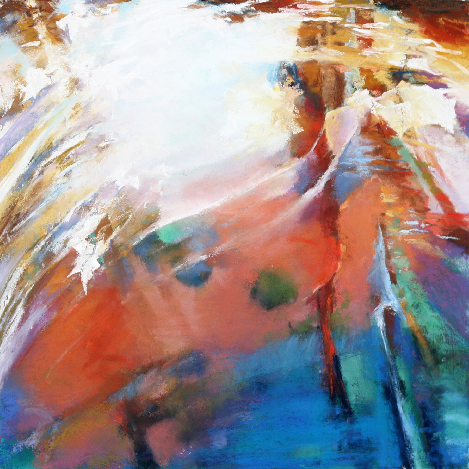
Colette Odya Smith’s paintings aim to portray both inner and outer realities. Whether rendered clearly or referenced obliquely, water, rocks and foliage are her artistic focus. She uses these subjects as the ‘doors’ through which she explores. More than mere depictions, the paintings are expressions of her discoveries. While remaining grounded in realism, she often creates passages of paint where one can get lost without concern for naming and words. She invites the viewer to respond with their own perceptions and appreciations of the mysterious beauty revealed in the humblest of scenes. She says that by using pastels and watercolor, she is charmed to be using the same elements of dust and water that she is drawn to paint. These images might be anywhere, but they are from her heart and she hopes they speak to yours.
Contact: coletteodyasmith.com
Image: Colette Odya Smith, Resonance 2, 2019, pastel/watercolor, 20 x 20 inches, $2,400

Similar to those who cloud watch, Talatzko constantly sees relationships worth denoting. Connections are everywhere when we are receptive to them. Talatzko’s art seeks to saturate traditional spaces with non-representational spray paint work. He aspires to promote wonderment in how we observe, perceive and interpret our surroundings. Many of us habitually process visual stimuli and move thoughtlessly along with our days. Talatzko conceptualizes his work playfully and constructs it with an emphasis on technique and presentation, challenging viewers to inquire, within themselves.
Contact: btalcreative.com
Connect: @btalcreative
Image: Ben Talatzko, Subtle Vibrations, 2019, spray paint on canvas, 18 x 24 inches, $900

Tayler’s current work is a combination of an emotive stream of conscience and aesthetic comforts. There is a certain language written in symbols and shapes that embody compartmentalizing the inner thoughts and feelings that others, himself included, tend not to show or reveal in day to day life. It depicts a mask of normality while underneath there’s always something wanting to break free but sometimes must be contained. The emotions that must be balanced on a daily basis that are mostly spoken through one’s own inner monologue. There’s certain guidelines and rules that seem to be set by society and people seem to lie to themselves on a daily basis to alleviate the stress of having to follow them. He feels more truthful statements rattle around in a blur while trying to be contained in a box of set ideals and life choices.
Contact: terrytayler.wixsite.com
Connect: @terry.tayler
Image: Terry Tayler, Where I Belong, 2020, mixed media on canvas, 36 x 48 inches, $1500

Vernau’s recent work consists of colorful, flooded interior spaces using layered and cut paper, color pencil, graphite, and string. There are quite a few symbols in this work: water, doors, letters (both physical text and envelopes), and picture frames. These can be seen to reference issues involving communication and relationships and the stability (or instability) surrounding them. The viewer reacts to these objects and what they convey to him or her, and the manner in which they are composed provide further reactions to what those symbols might mean.
Contact: nathanvernau.com
Connect: @nathanvernau
Image: Nathan Vernau, Pay attention to the mailroom, 2020, graphite, color pencil, paper, and string, 15 x 18 inches, $300
Other: Nathan Vernau, Empathy is good, 2020, paper, 14 x 18 inches, $300

Mark Weller use his camera like a painter uses a brush. It moves, lingers, explores and dances with his subjects. While traditional photography generally captures three dimensions, Weller’s images explore the fourth dimension: time. The results are painterly like creations that evolve traditional photography beyond the customary landscape. The images are of real places captured over time. But through a process called “Timestacking” they are transformed into an alternative way to view reality. There are a couple variations used, but the images are usually multiple exposures – oftentimes up to 100 – that are then intermingled into a final frame. This allows the images to accentuate movement and results in bold colors and shapes. It bends traditional photography and uses new technologies to give my photographs a look suggesting post impressionism and abstraction. These painterly creations seek to alter the way one looks and experiences the familiar.
Contact: time-stacking.com
Image: Mark Weller, Deep Blue, 2017, Timestacking Photography, 36 x 24 inches, $1100

In my paintings and works on paper I seek to capture the essence of the natural world, connecting with specific places and narratives. Color is an entry to that connection, especially during early spring in the Driftless Region. Color has an indelible presence in the human psyche, in perceptual experience, and in culture. From the muted palette of the bluffs and river valleys, the deepest reds emerge in elf ear fungi and symplocarpus foetidus (also known as skunk cabbage). This seductive color is itself rooted in the landscape, in the imagination and in the body, like a powerful chakra. These paintings are a response to that sense of wonder and energy out of subtlety.
Contact: jennwilliamsart.com
Connect: @annejennxpainting
Image: Jen Williams, Emerging Spring Cabbage, 2020, oil on Arches oil paper, 12 x 9 inches, $225

I create over-the-top and whimsically feminine acrylic paintings that are visually dense. Enchanting female images in a sickeningly saccharine sweet range of hues not only pay homage to my fondness for retro glamour but are also symbolic of strong women with a nod to contemporary feminism.
I find enjoyment in a juxtaposing an eclectic menagerie of organic shapes and patterns while intertwining pin-up women that are reminiscent of mid-twentieth century popular culture. In my paintings these women serve as a dichotomy. Not only do the women that I render exhibit obvious physical beauty but they also display a combative and mysterious disposition that is often overlooked and dismissed at first glance. Read more.
Contact: kellywitteart.tumblr.com
Connect: @kellywitteart
Image: Kelly Witte, Sweet Sixteen (mom circa 1968), 2020, acrylic and aerosol on canvas, 12 x 12 inches, NFS